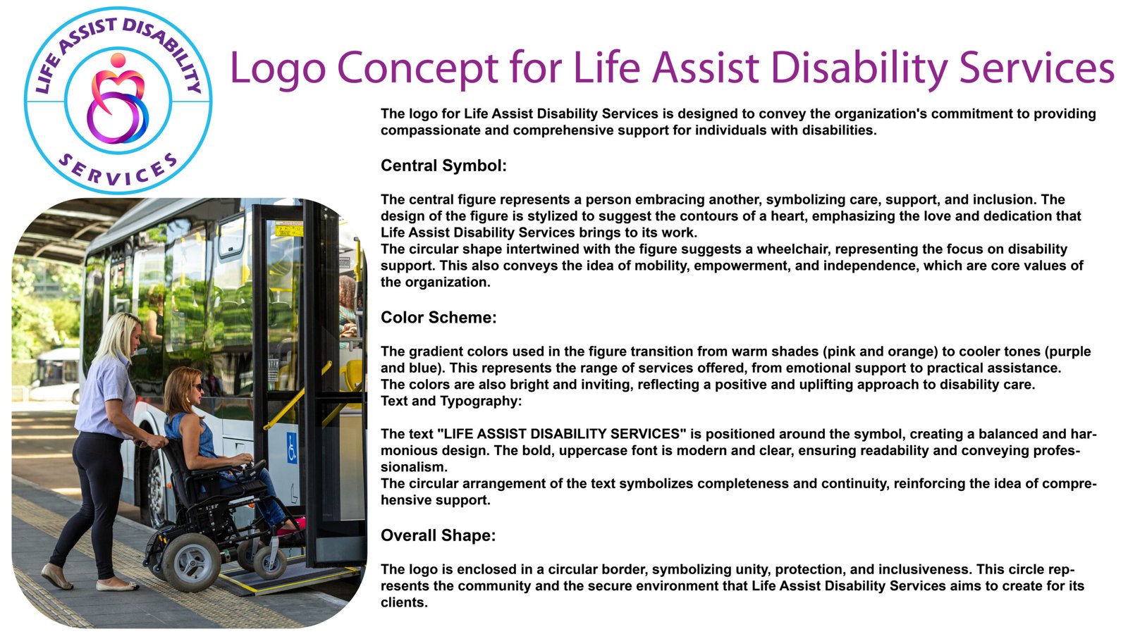
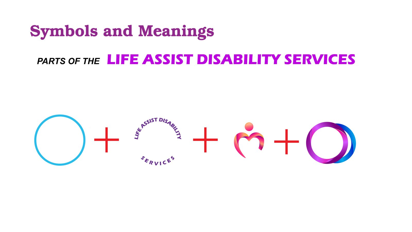
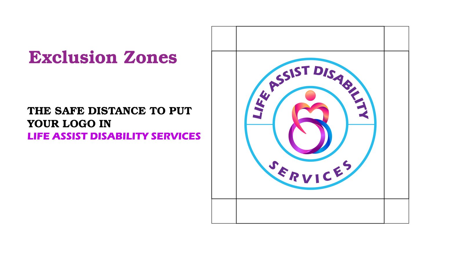
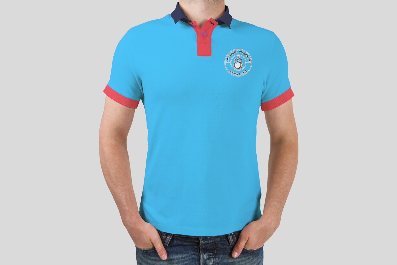
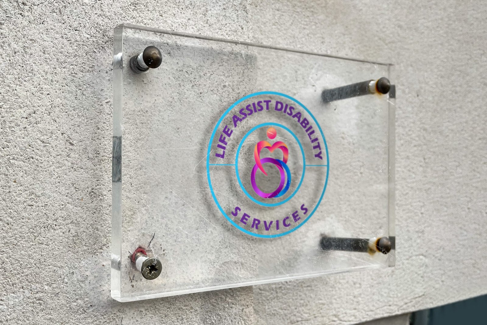
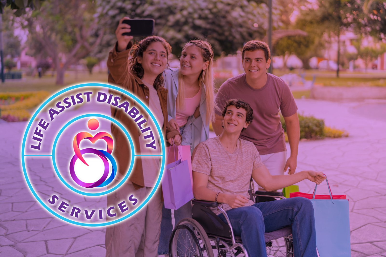
The logo for Life Assist Disability Services is designed to convey the organization’s commitment to providing compassionate and comprehensive support for individuals with disabilities.
Central Symbol:
The central figure represents a person embracing another, symbolizing care, support, and inclusion. The design of the figure is stylized to suggest the contours of a heart, emphasizing the love and dedication that Life Assist Disability Services brings to its work. The circular shape intertwined with the figure suggests a wheelchair, representing the focus on disability support. This also conveys the idea of mobility, empowerment, and independence, which are core values of the organization.
Color Scheme:
The gradient colors used in the figure transition from warm shades (pink and orange) to cooler tones (purple and blue). This represents the range of services offered, from emotional support to practical assistance. The colors are also bright and inviting, reflecting a positive and uplifting approach to disability care. Text and Typography:
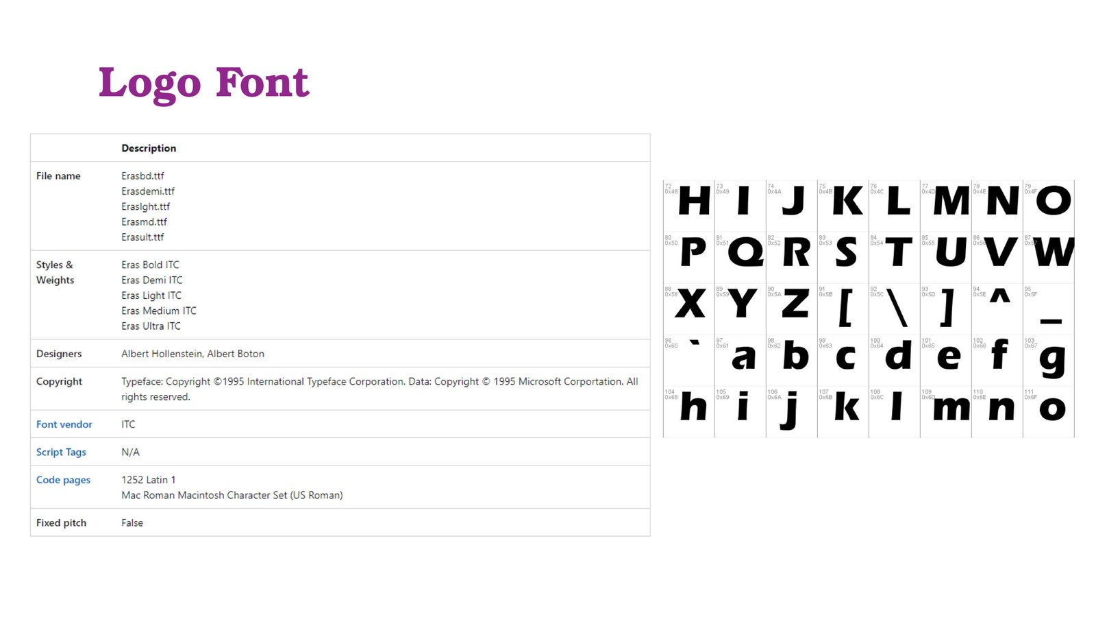
The text “LIFE ASSIST DISABILITY SERVICES” is positioned around the symbol, creating a balanced and harmonious design. The bold, uppercase font is modern and clear, ensuring readability and conveying professionalism. The circular arrangement of the text symbolizes completeness and continuity, reinforcing the idea of comprehensive support.
Overall Shape:
The logo is enclosed in a circular border, symbolizing unity, protection, and inclusiveness. This circle represents the community and the secure environment that Life Assist Disability Services aims to create for its clients.